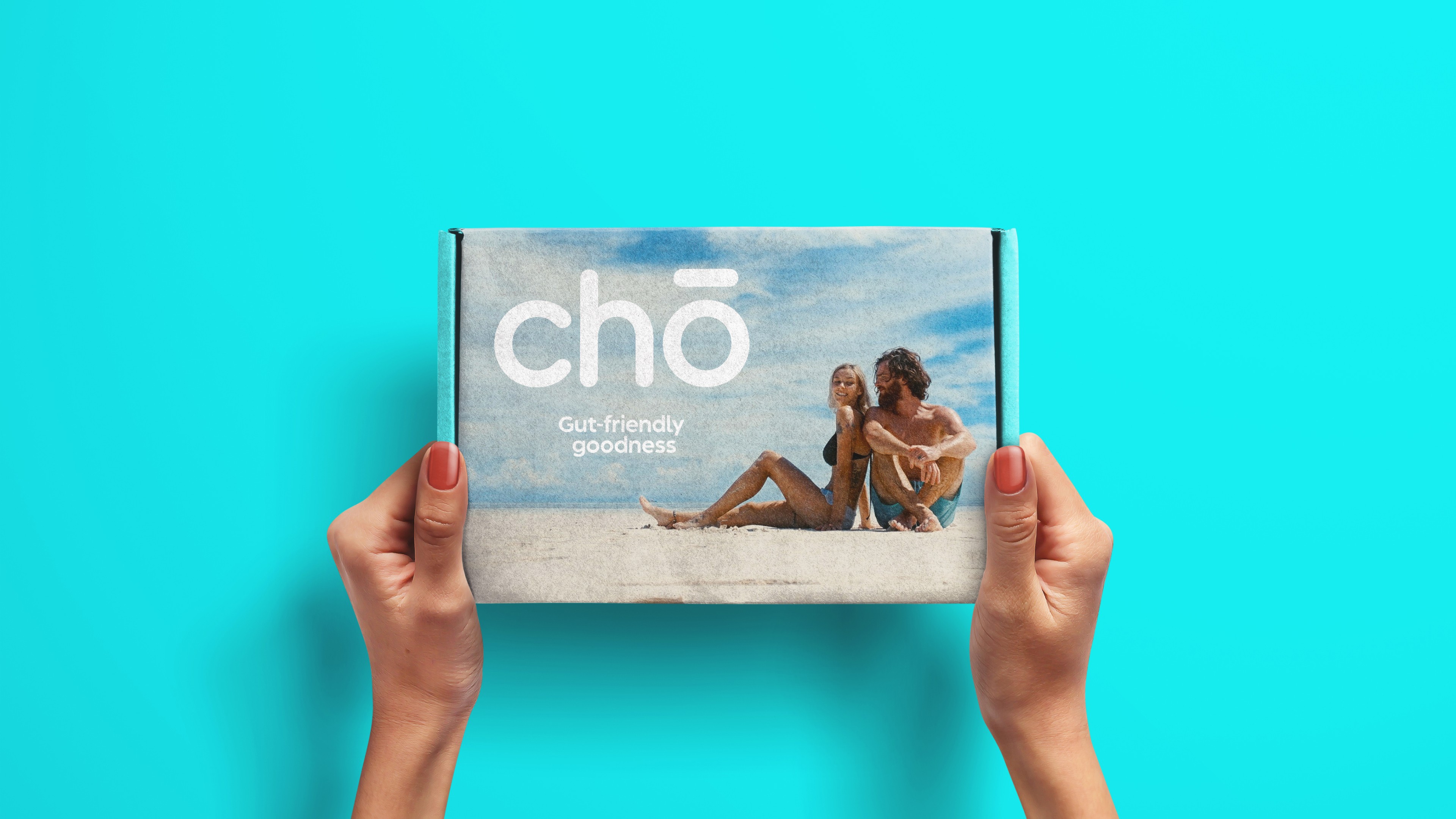
Chō is a modern gut-health brand designed to bring clarity, confidence and calm to an increasingly crowded wellness market. Positioned between clinical credibility and lifestyle aspiration, the brand needed to feel science-driven yet human, grounded in research but expressed with warmth and vitality. The result is a bold, fresh identity built on vibrant gradients, soft minimal typography and confident product presentation.
Chō
Health & Wellness


The probiotic and supplement market is saturated with two extremes: sterile pharmaceutical aesthetics or overly “natural” organic clichés. Consumers are increasingly informed, sceptical and visually literate. They expect transparency, scientific grounding and a brand they can trust, without sacrificing beauty or aspiration.
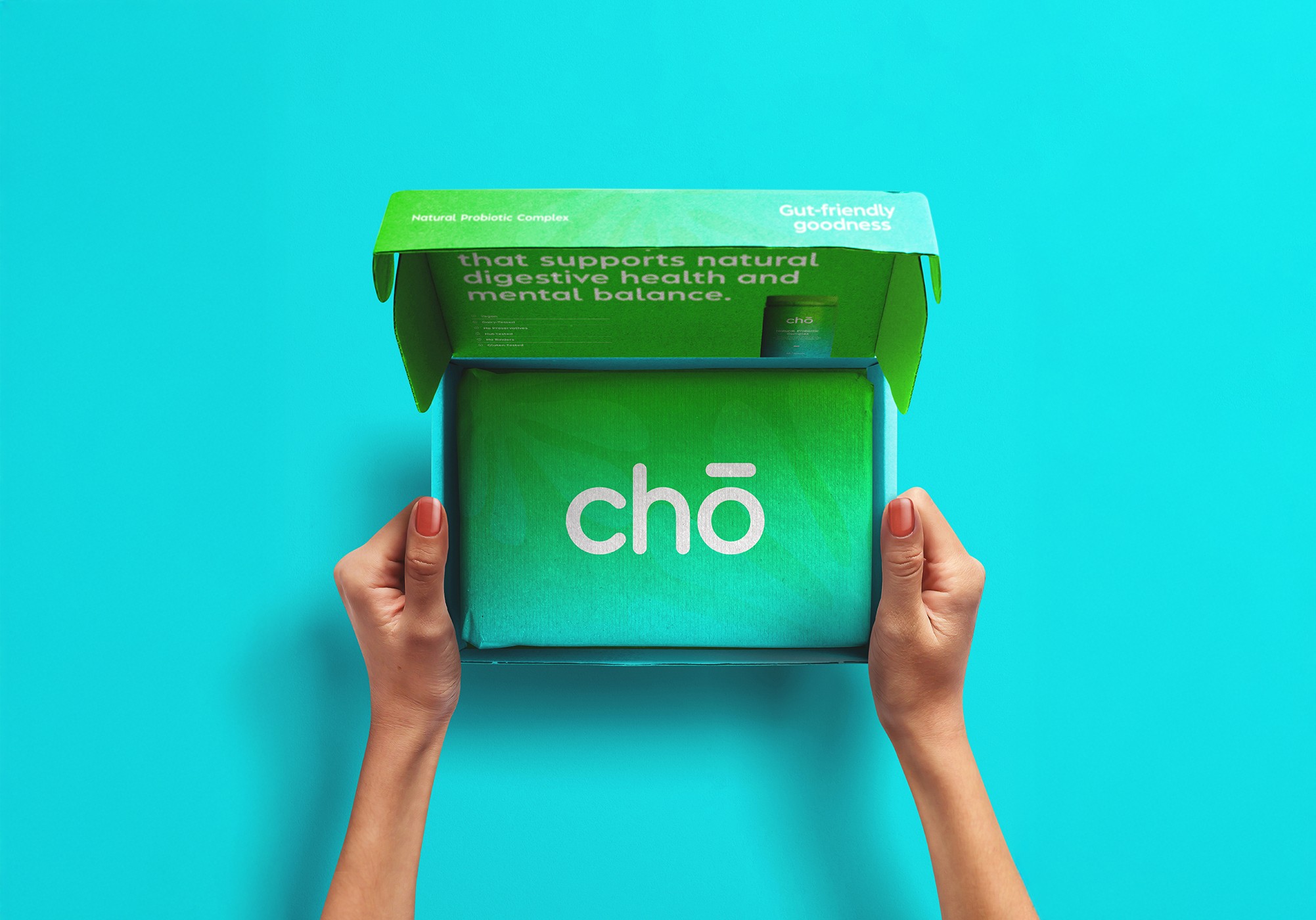
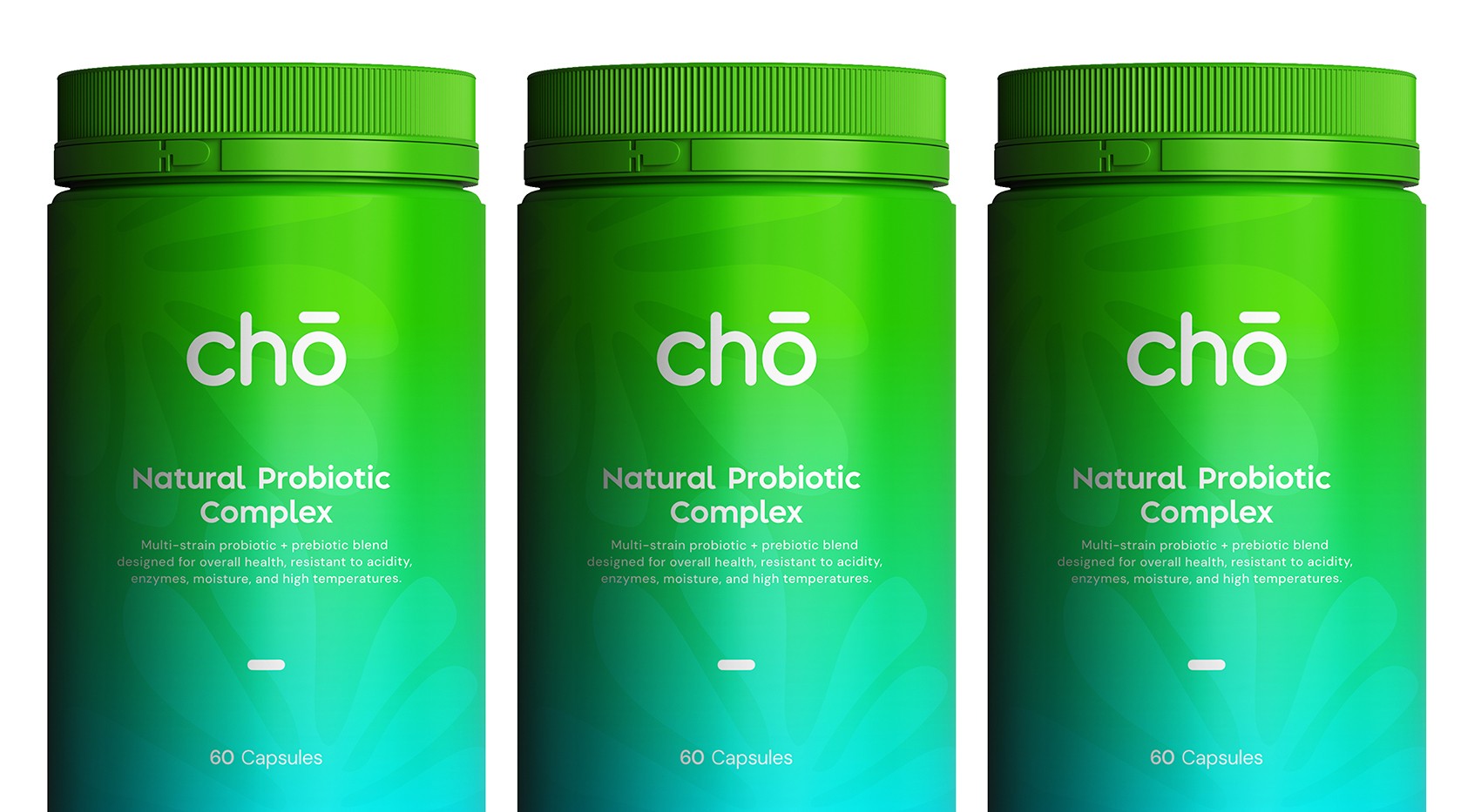
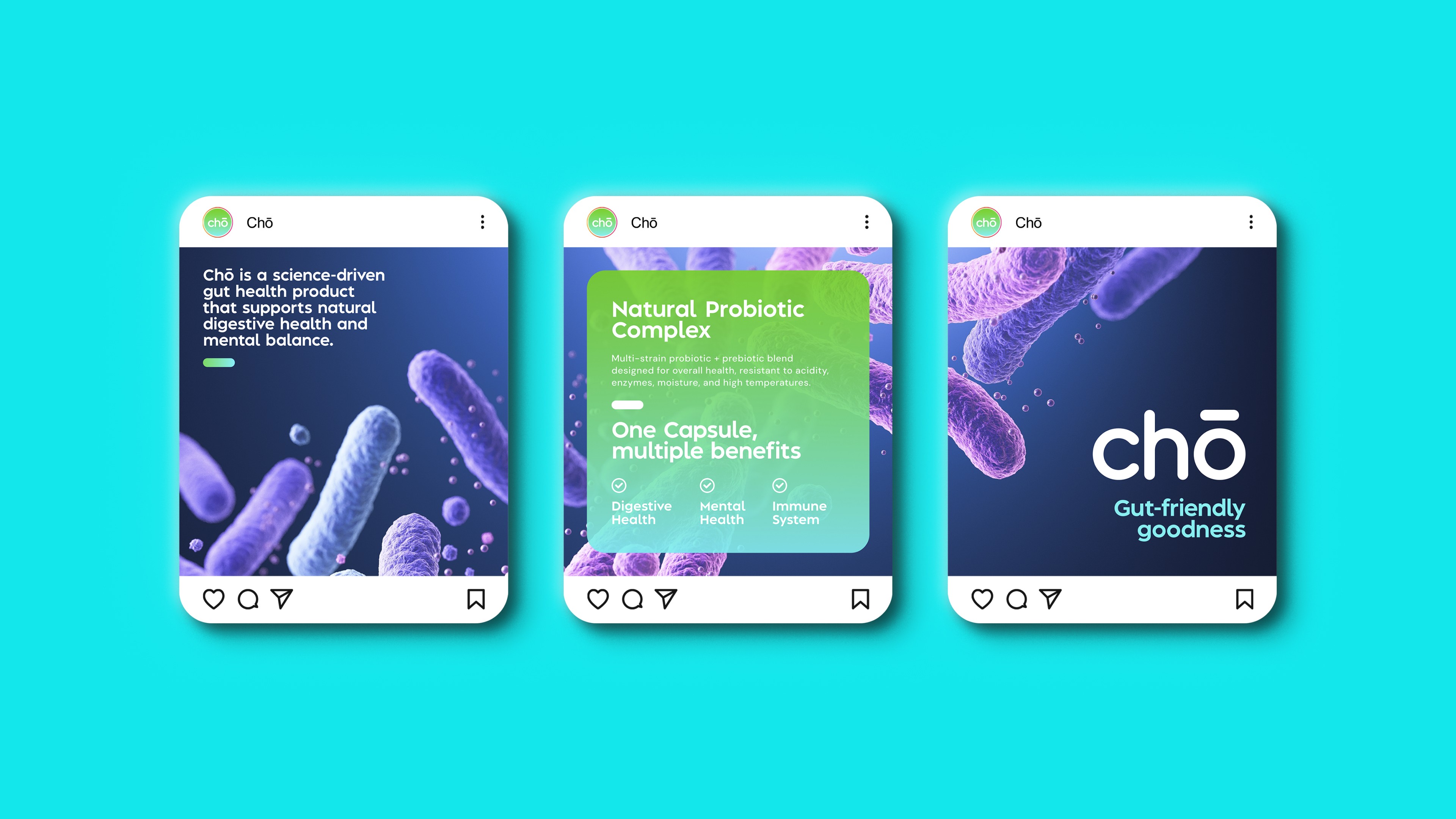
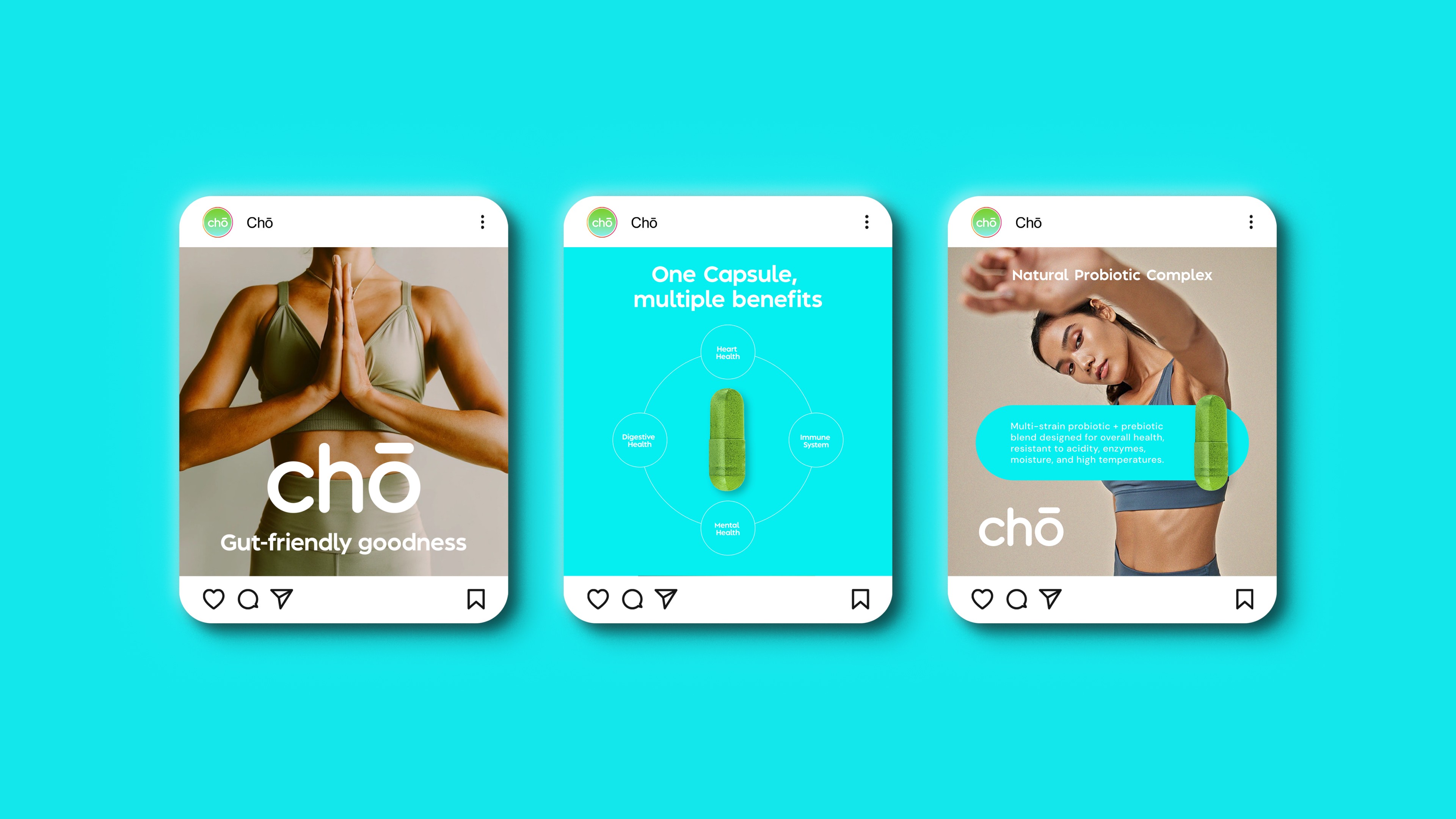
Chō responds to this shift. The visual system blends laboratory cues (microbial imagery, structured information hierarchy, clean sans-serif typography) with lifestyle-led storytelling that connects gut health to energy, mood and everyday wellbeing. The green-to-turquoise gradient becomes both a distinctive shelf asset and a metaphor for balance and digestion meeting vitality.
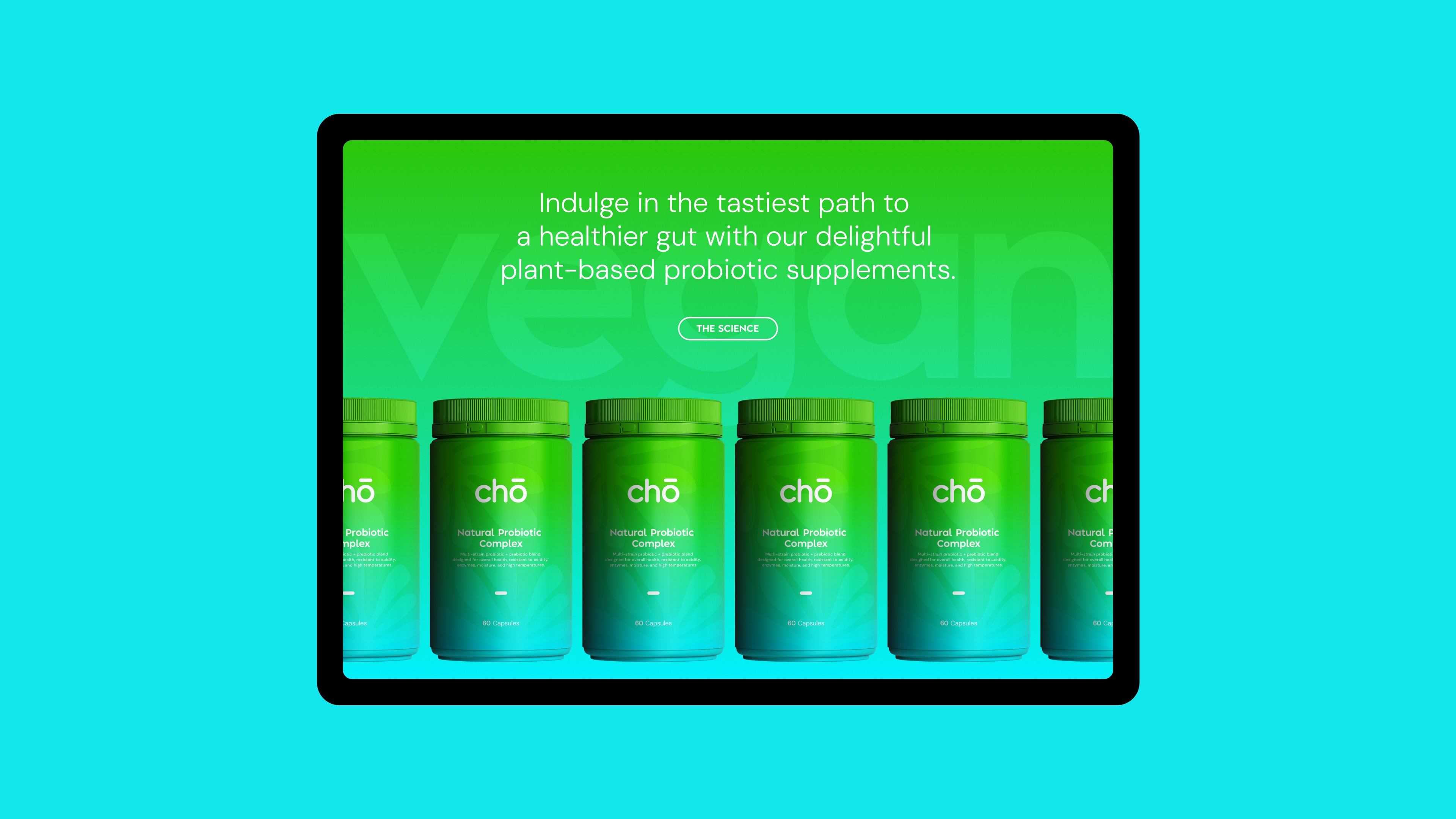
The identity centres around a refined logotype and a vibrant colour system designed to cut through retail and digital environments. Packaging was crafted to feel premium yet accessible, with strong typographic hierarchy and simple benefit-led messaging: One Capsule, Multiple Benefits.
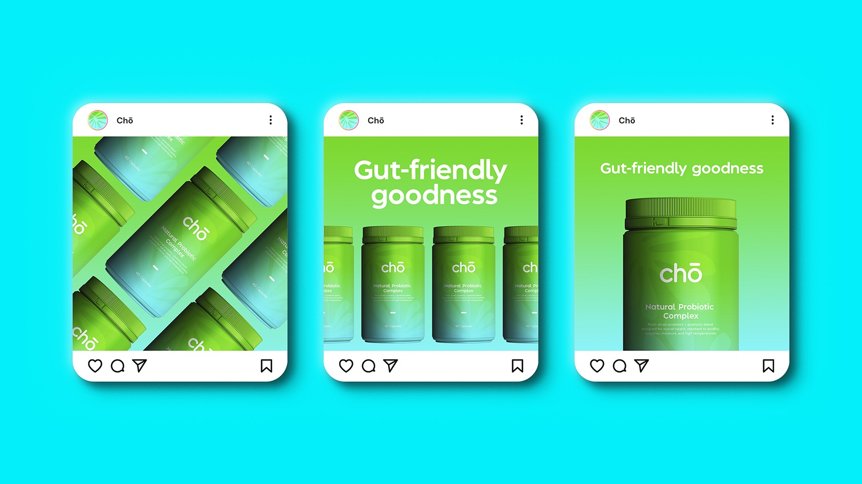
Across web, social and product photography, the brand language balances clinical trust with lifestyle optimism. Scientific credibility is communicated through structured layouts and clear feature callouts, while expansive imagery and soft gradients create emotional resonance.
The outcome is a cohesive brand world that feels contemporary, confident and scalable, capable of standing out in a competitive wellness space while maintaining authority and trust.